
Why I Switched: Moving from Dark to Light Mode in 2026
- Richard Sadd
- May 5
- 2 min read
Updated: May 7
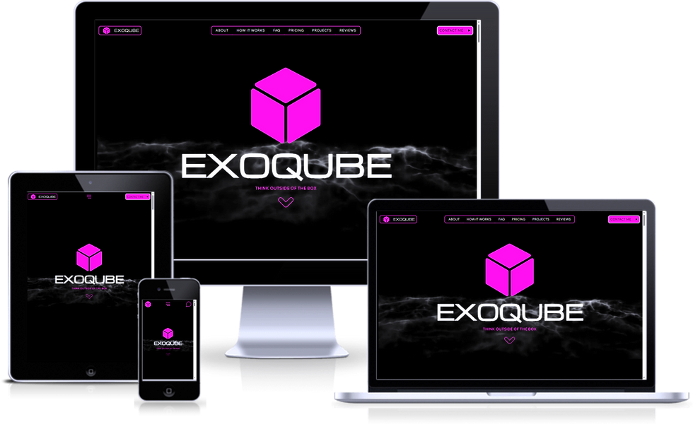
For the longest time, I was part of the "dark mode or bust" club. I loved the sleek, high-contrast look, the supposed reduction in eye strain, and the modern vibe it gave my portfolio.
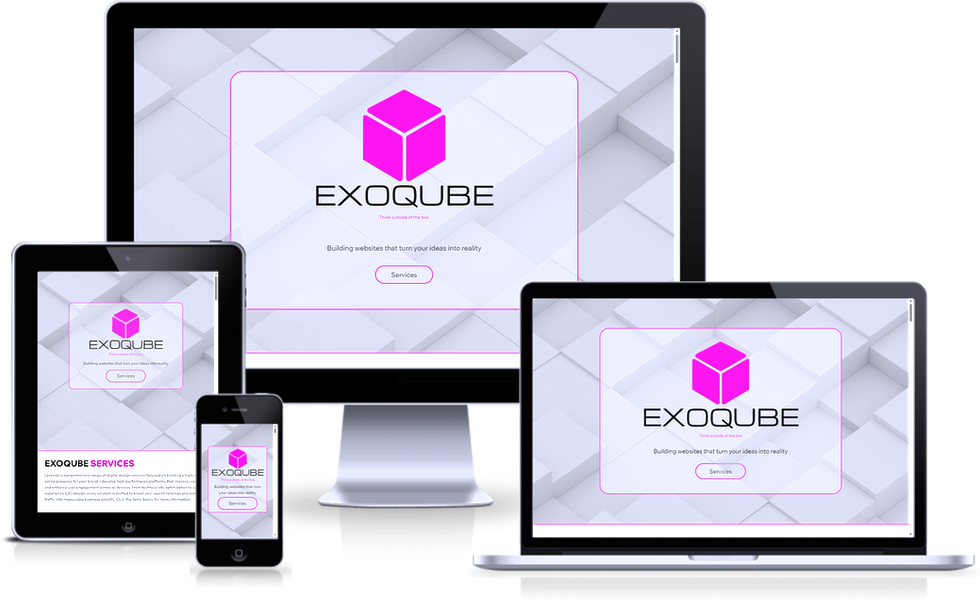
However, after running my website with a dark theme for a few years, I recently decided to make a major pivot: I switched to a light theme.
It wasn't a decision I made lightly. It required a full reassessment of my branding, content, and, most importantly, my audience. Here is why I updated my theme from dark to light.
1. Prioritising Readability
While dark mode is trendy, research suggests that for many users, particularly those with astigmatism, dark text on a light background provides superior readability and less visual distortion.
As I started focusing more on long-form content, I noticed my own eyes getting tired trying to read bright text on a pitch-black background. By switching to a light theme, I am offering a more comfortable, "paper-like" reading experience that ensures the content, not the design, is the focal point.
2. Enhancing Accessibility
With web accessibility standards becoming more rigorous, I wanted to ensure my website was usable for everyone. While dark themes can be accessible, they often require complex colour adjustments to meet contrast requirements.
A light theme makes it much easier to maintain high contrast, ensuring accessibility for users with visual impairments without having to compromise on aesthetics.
3. Better Performance in Bright Environments
I realised that many of my users are visiting during the day, in bright offices or even outdoors. Dark mode emits less light, making it difficult to see in high ambient light environments.
Light mode is simply more versatile. It adapts better to various lighting conditions, ensuring my site looks crisp whether you are reading on a mobile in the park or on a desktop in a dim room.
4. A Cleaner, Professional Brand Vibe
Dark mode is often perceived as "techy" or edgy. While that is great for some, I wanted my site to convey openness, professionalism, and clarity. Light themes are frequently associated with transparency and trustworthiness.
My new light theme feels airy and organised, allowing me to use pops of colour to highlight important information, rather than relying on neon text to stand out against black.
The Verdict: Context is King
Dark mode isn't "bad," but I realised it wasn't right for my content. For a blog or a text-heavy site, light mode is currently the superior choice for user experience.
What about you? Are you still a dark mode devotee, or have you made the switch back to light?
Let me know in the comments!


